Tomasino Font (Part 1)
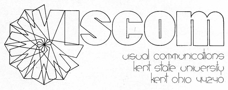
In the early 70’s, my dad was a student at Kent State University. You may be familiar with the school from a little incident that happened during the Vietnam War. During his time there as an art student, he designed a logo for the Visual Communications department for a project, as can be seen above. We used to have a copy of the finished logo design hanging on one of the walls in our house when I was growing up, and it brought up conversations on a few occasions. The most interesting part of the design to me was the font he created to do the lettering under the logo. These were the 70’s, folks. Font’s weren’t things you downloaded and installed back then. They were done with rulers, compasses, and rapidographs. Pretty impressive, no?
Well, this ain’t the 70’s no more, son. and while his font is awesome, it’s not something he can use on his business cards or letterhead, let alone the family newsletter / Christmas card. That, my friends, is totally unacceptable. So I decided a while ago that I was going to convert it to a true-type font for him. I never had the time to do it before, but with the recent unemployment I decided to give it a go. After a solid day of learning the in’s and out’s of font creation, I have a reasonably usable draft of the font. I say draft for two reasons: First, the font is based on the hand-drawn draft used in his logo design. The lines aren’t completely uniform, the verticals on the “m” aren’t quite centered, you get the idea. Second, my implementation of it is really rough. The weights aren’t balanced, the kerning is really basic, and some of the characters are just shoddily made. Still, it’s a strong start. Take a look:
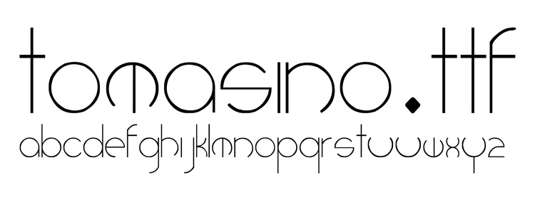
I intend on cleaning this version up a little bit (redrawing the Z, centering some things better, fixing some weights), but I’m going to keep it imperfect to a point. The font family “Tomasino” will always have the “Draft” face available to represent the original. Only after that’s all done will I go back and create a beautifully perfect vector version, as my dad surely intended his drawing to represent. This will form the eventual “Regular” face.
Who knows when I’ll have the time to finish it all, so I thought I’d better share what I made so far. Look forward to seeing part 2 of this post someday in the distant future.